Creating a quadratic default font
A quadratic default font is the center of the parametric designspace.
draft
Introduction
The default font is the center of the designspace. As a rule, it should be the first source to be created. All other sources start as copies of the default.
In order to create quadratic variable fonts, it is preferable to work directly with quadratic contours (instead of drawing in cubics and automatically converting to quadratics on font generation).
Depending on the project we can either draw glyphs from scratch as quadratic contours, or start by converting from existing cubic contours.
Converting from cubic contours
Cubic glyphs can be automatically converted to quadratic, but the result needs to be manually reviewed and corrected. Redundant points should be cleaned up, without distorting the original drawing. The proper point types (corner, smooth or smooth) should also be chosen.
Scaling the font
- TrueType em-square needs 2000 or 2048 UPM
- scale cubic contours before converting to quadratic
- use Slinky to scale the whole font
Deciding on the point structure
When deciding on the quadratic point structure, consider how the glyph shape will change across the entire designspace, and include all necessary points even if they are not required for the default.
It is recommended for curve segments to always have two off-curve points – this makes it easier for the designer to edit the shapes. The script below can be used to find glyphs which have more or less than 2 off-curve points per curve segment in a given font.
# menuTitle: find unwanted off-curve points

from xTools4.modules.validation import findUnwantedQuadraticOffCurvePoints

font = CurrentFont()

findUnwantedQuadraticOffCurvePoints(font)
When converting from cubic to quadratic contours, it is also required to revert the contour direction — in TrueType fonts, the external contours are clockwise.
Examples
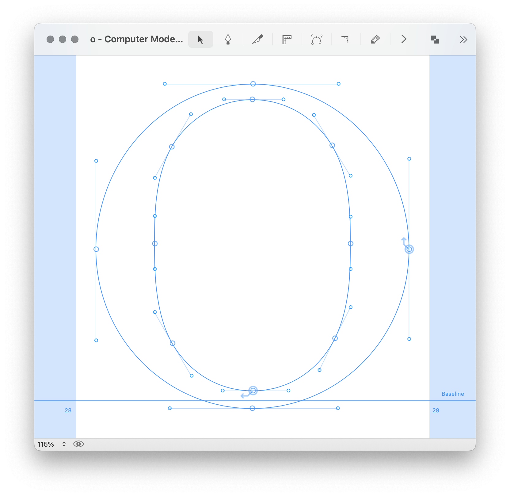
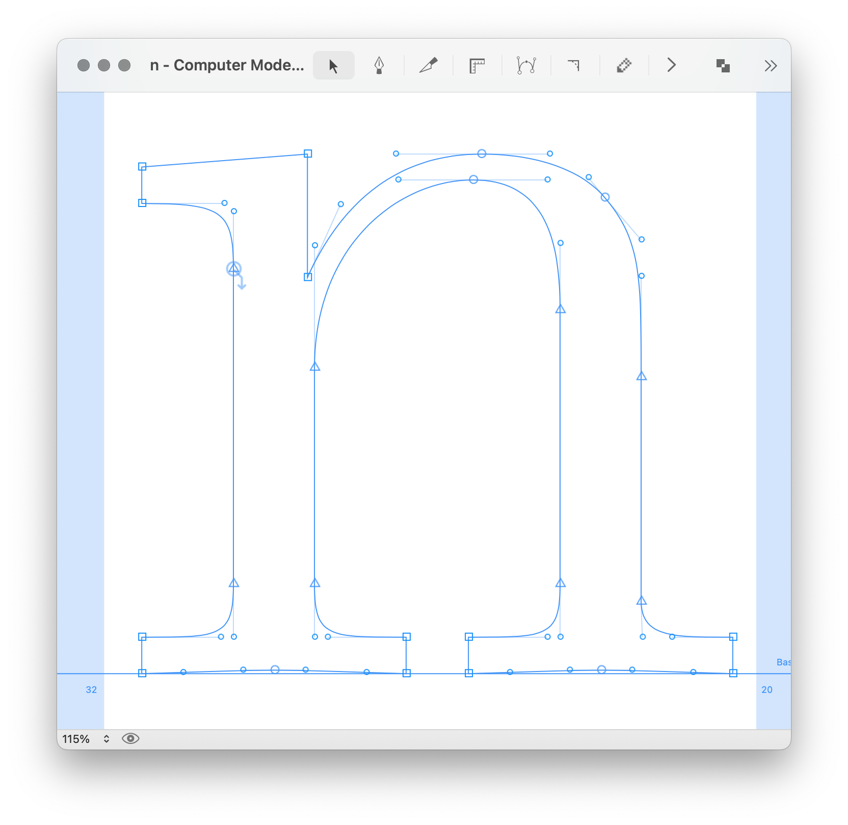
Cubic (left) and quadratic (right) versions of the same glyph.
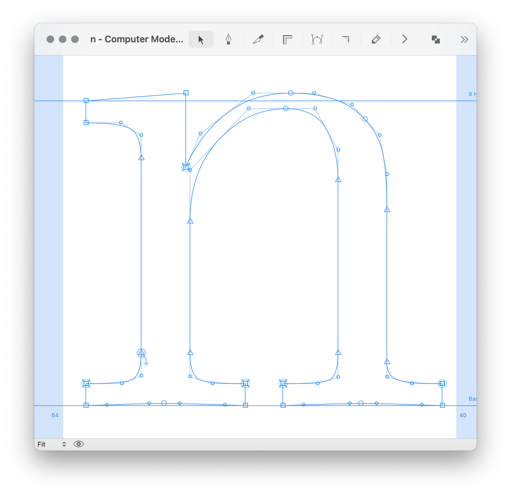
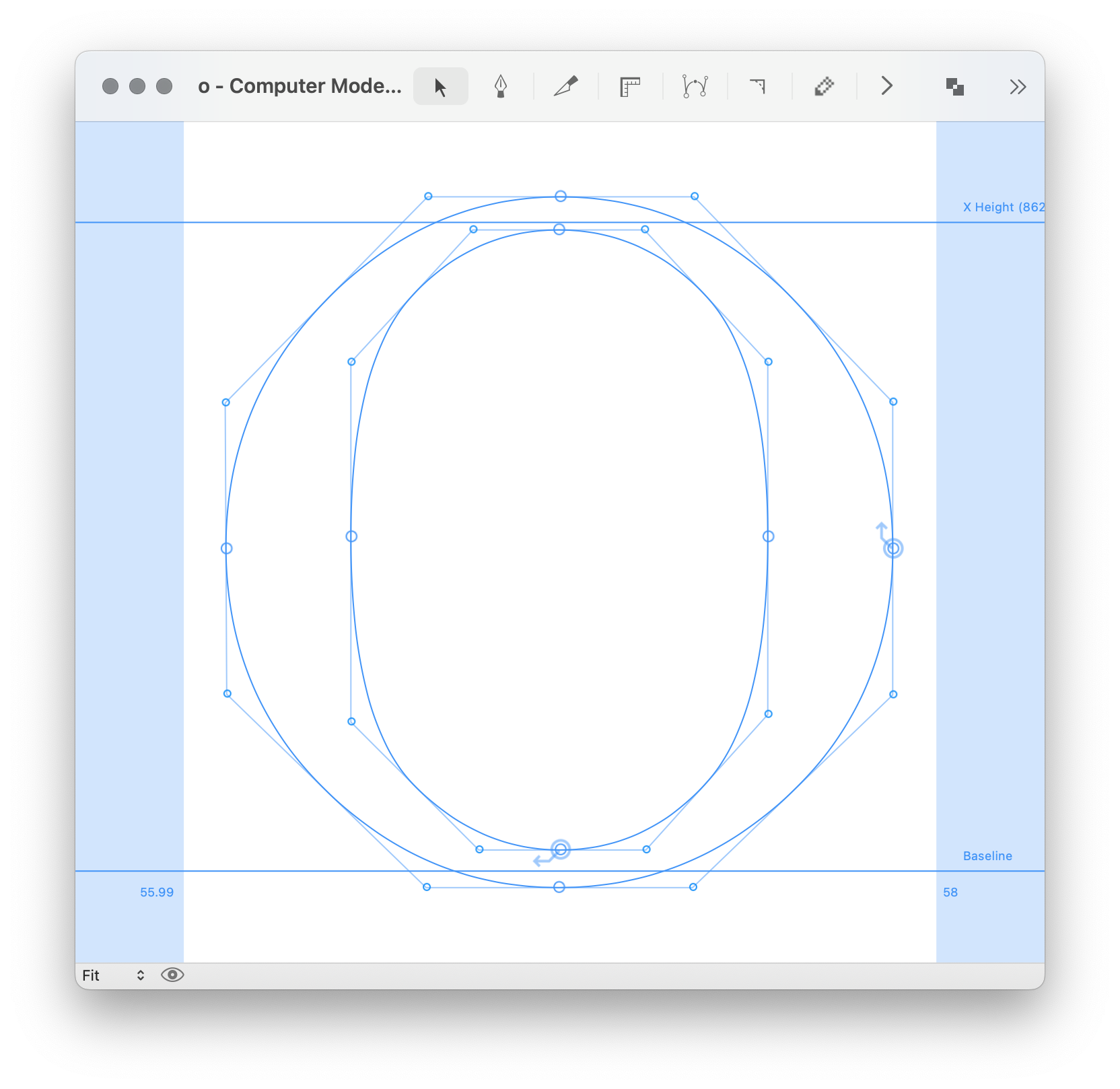
Cubic (left) and quadratic (right). Notice the overlapped points at the serifs and crotch of the quadratic, which are needed for bolder and smaller styles.
Notes about italics contours
When preparing a quadratic default font for italic, it’s recommended to have vertical extremes with the same angle as the font’s italic angle.
The horizontal extremes should be perpendicular to the italic angle – this approach helps to get nicer curves.